Interior Core
A nine-page website for a New Delhi interior design studio, built mobile-first so homeowners can browse finished projects, estimate their budget, discover their style and book a studio visit — all before they pick up the phone.




Scroll to see the full page
What the Studio Needed
Before any design work began, the brief came down to three clear priorities.
Look as Good as the Work
Homeowners choose a designer by what they see. The site had to feel as premium as the rooms the studio builds.
Work Perfectly on a Phone
Most interior enquiries start on a phone and end in a call or a WhatsApp chat, so mobile came first, not last.
Answer “What Will It Cost?” Early
Budget is the first question every homeowner has. The site needed to give an honest range before the first meeting.
Take the Tour
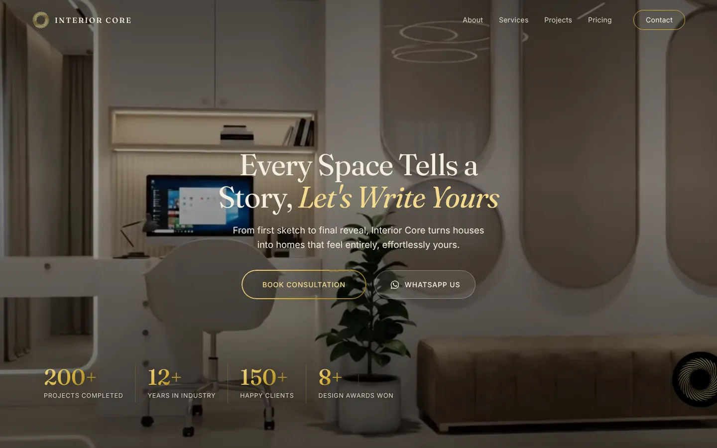
Home
A full-screen video hero with two clear next steps — Book Consultation or WhatsApp Us — followed by the studio’s story, services, a before/after slider, a photo gallery, featured projects, the five-step process, reviews, pricing, FAQ and a contact form.
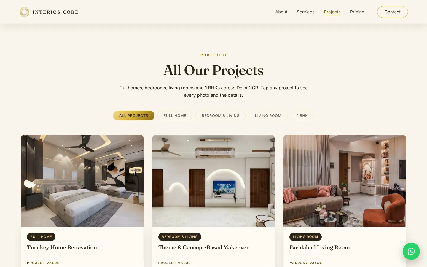
Projects
Every project in one place, filterable by type — full homes, bedrooms and living rooms, living rooms and 1 BHKs — with the project value shown upfront on each card.
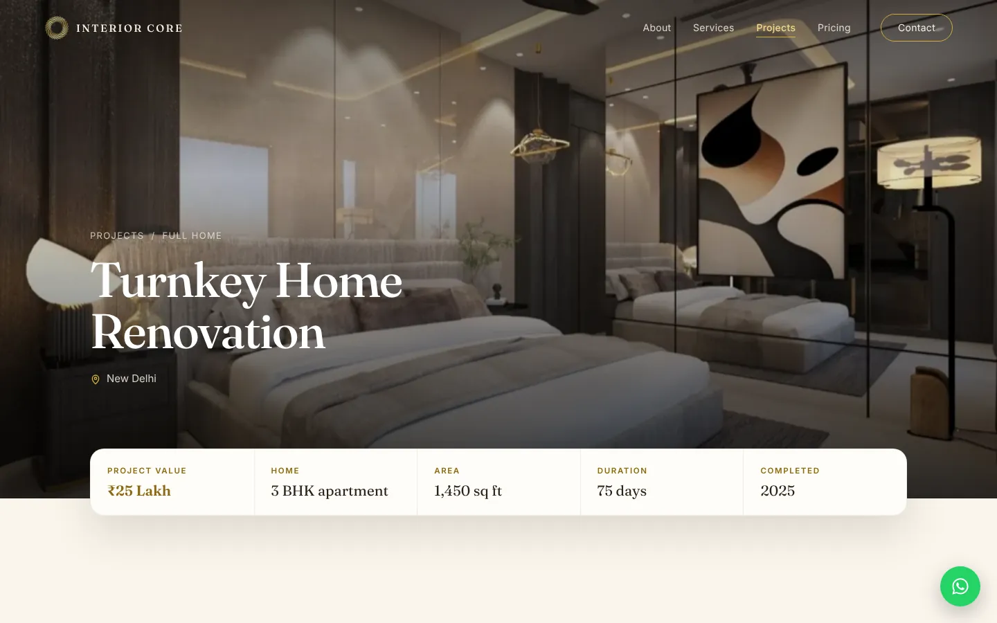
Project Case Studies
Each of the eight projects opens into its own case-study page: project value, home type, area, duration and year at a glance, followed by the full photo story of the space.
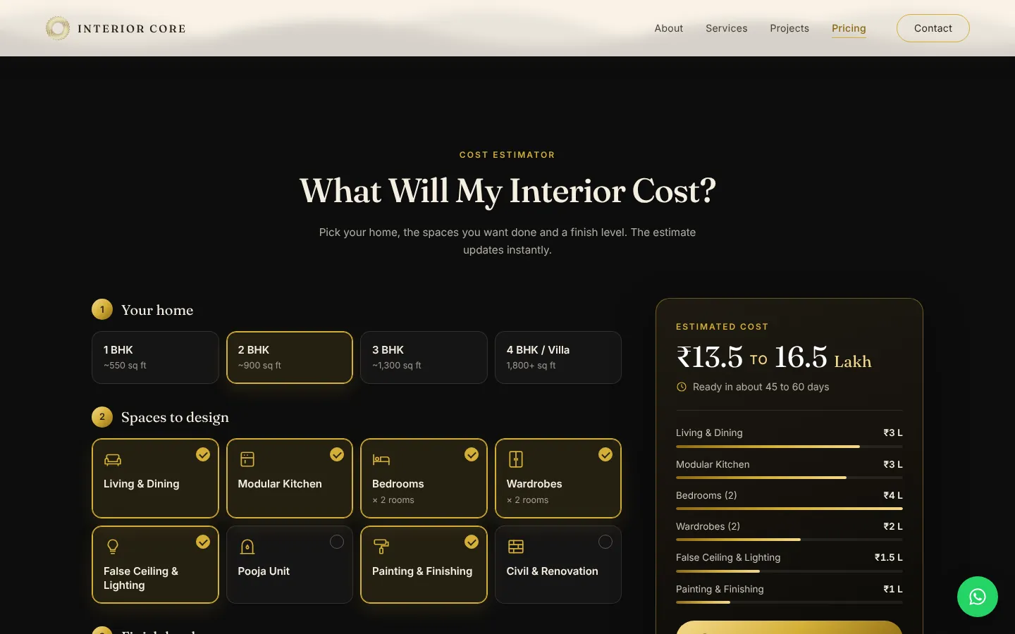
Cost Estimator
Homeowners pick their home size, the spaces they want designed and a finish level, and get a live cost range and timeline — answering the budget question before the first call.
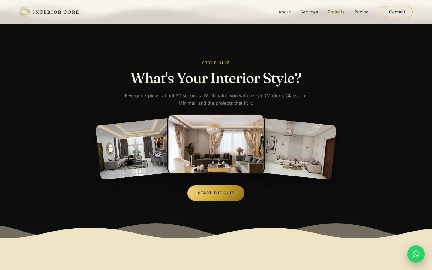
Style Quiz
Five quick picks, about 30 seconds, and the quiz matches visitors with a style — Modern, Classic or Minimal — and the projects that fit it.
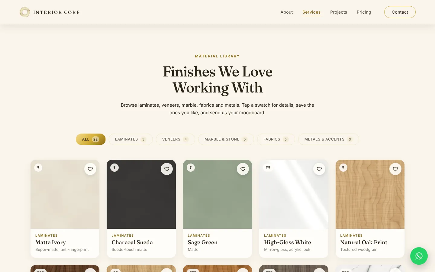
Material Library
Laminates, veneers, marble, fabrics and metals, filterable by type. Visitors save the finishes they like into a moodboard and send it straight to the studio.
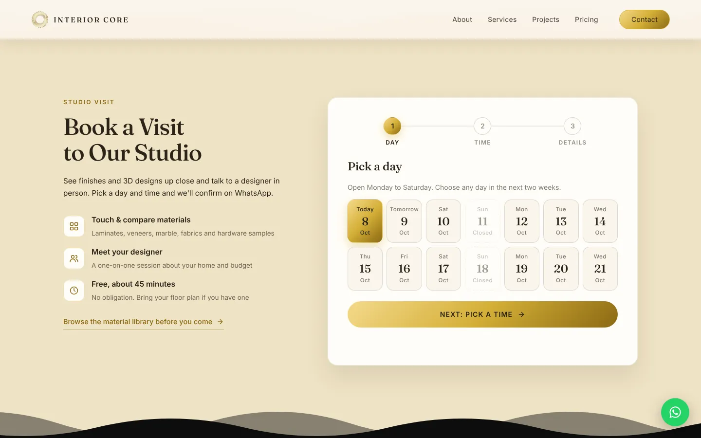
Studio Visit Booking
A step-by-step booking flow — pick a day, pick a time, add details — that confirms the visit on WhatsApp. No forms to email, no back-and-forth.
Built Mobile-First
Design started at a 360 px phone screen, then grew to tablet and desktop.
Call & WhatsApp Always in Reach
A sticky Call, WhatsApp and Get Quote bar sits at the bottom of every page on phones, and a WhatsApp button on desktop.
Made for Thumbs
Every button is easy to tap, and services, reviews, galleries and project photos all swipe naturally.
Fast on Mobile Data
Every photo was rebuilt as WebP in two sizes, the hero video was cut down, and all scripts ship as one small file.
How We Got There
Three phases, from a single page to a complete studio website.
-
Core Sections Phase 1
Hero, about, services, before/after, gallery, portfolio, process, reviews, pricing, FAQ and contact — each designed for phones first.
-
Pages & Tools Phase 2
Separate Services, Projects, Pricing and Contact pages, plus the cost estimator, a case-study page for every project and studio visit booking.
-
Polish & Speed Phase 3
Material library, style quiz, logo intro, smooth page transitions and a custom 404 — then lighter media, one minified script and clean, organised code.
What We Built
Every feature, built to turn a visitor into a consultation.
Video Hero
A full-screen video hero with clear calls to action and the studio’s numbers at a glance.
Sticky Call & WhatsApp Bar
One tap to call, chat on WhatsApp or ask for a quote, from anywhere on the page.
Before / After Slider
Drag across a room to see it before and after the studio’s work.
Filterable Portfolio
Projects sorted by type, with a full-screen photo viewer for each one.
Case Study per Project
Eight projects, each with its own page of details and photos.
Cost Estimator
A live budget range and timeline based on home size, spaces and finish level.
Style Quiz
Five picks that match visitors with a style and the projects that fit it.
Material Library & Moodboard
Finishes to browse, save and send to the studio in one message.
Studio Visit Booking
Day, time and details, one step at a time, confirmed on WhatsApp.
Live “Open Now” Hours
Studio hours with a badge that shows whether the studio is open right now.
Google-Style Reviews
Review cards that glide on their own and can be dragged or swiped.
Custom 404 Page
“This room hasn’t been designed yet” — a dead end that still points visitors somewhere useful.
The Hardest Part
Heavy media. The studio’s original photos and video came to 61 MB — far too much for a phone on mobile data. We rebuilt every image as WebP in a phone size and a desktop size and cut a lighter video, bringing the whole site down to 13 MB without losing the look.
Let’s Build Yours Next
Want a Website Like This?
Tell us about your studio and let’s build a website that books consultations.
Contact Us- Mobile-First
- Built to Convert
- Fast on Mobile Data